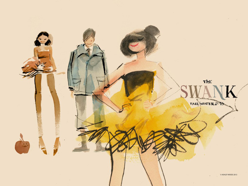
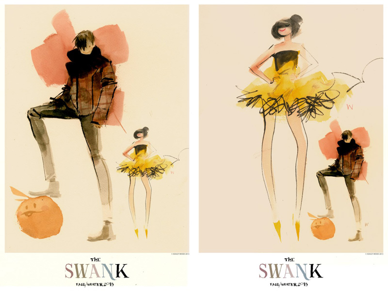
等了又等,終見有人有膽量試一些新點子。宣告要重新改變形象的Swank,找來在業界享負盛名的國際級插畫師Ashley Wood為其秋冬季廣告專輯作畫。是次Wood的創作充滿新鮮感、獨特且甚具啟發性,與他一貫喜以黑暗、單色調說故事,而題材大膽的風格有點出入。他那黑暗、充滿啓示錄色彩,且總帶點色情的風格,叫人難以將他跟Swank兩者聯想在一起,但就是因為意想不到,更令是次合作變得更難能可貴。看來Swank要改變品牌形象並重踏上品味之路的野心十分堅決,這個充滿驚喜的合作計劃,確實抵讚!
Now here we go! Some one with the balls to step to the plate with a truly fresh idea. New, distinctive and artistic, the FW13 ad campaign from The SWANK features illustrations by none other than world class artist Ashley Wood. As The SWANK defines its image make over, this is one giant step to the moon. How did this collab- oration come about? Who recommended Ashley Wood of all people? We promise to follow up. From the looks of it, the images seem quite inspired. Quite a departure from the dark, nearly monotone palettes Ashley usually deploys, not to speak of the subject matter. If you are familiar with his work, Ashley’s illustrations are post-apocalyptic, dark, and sexually charged. Not something you would immediately tie to The SWANK, but all the better for it; even braver to collaborate. Watch out now, a warning shot that The SWANK has returned to prominence. Salute!


Speak Your Mind